SMBP
Self-measure blood pressure
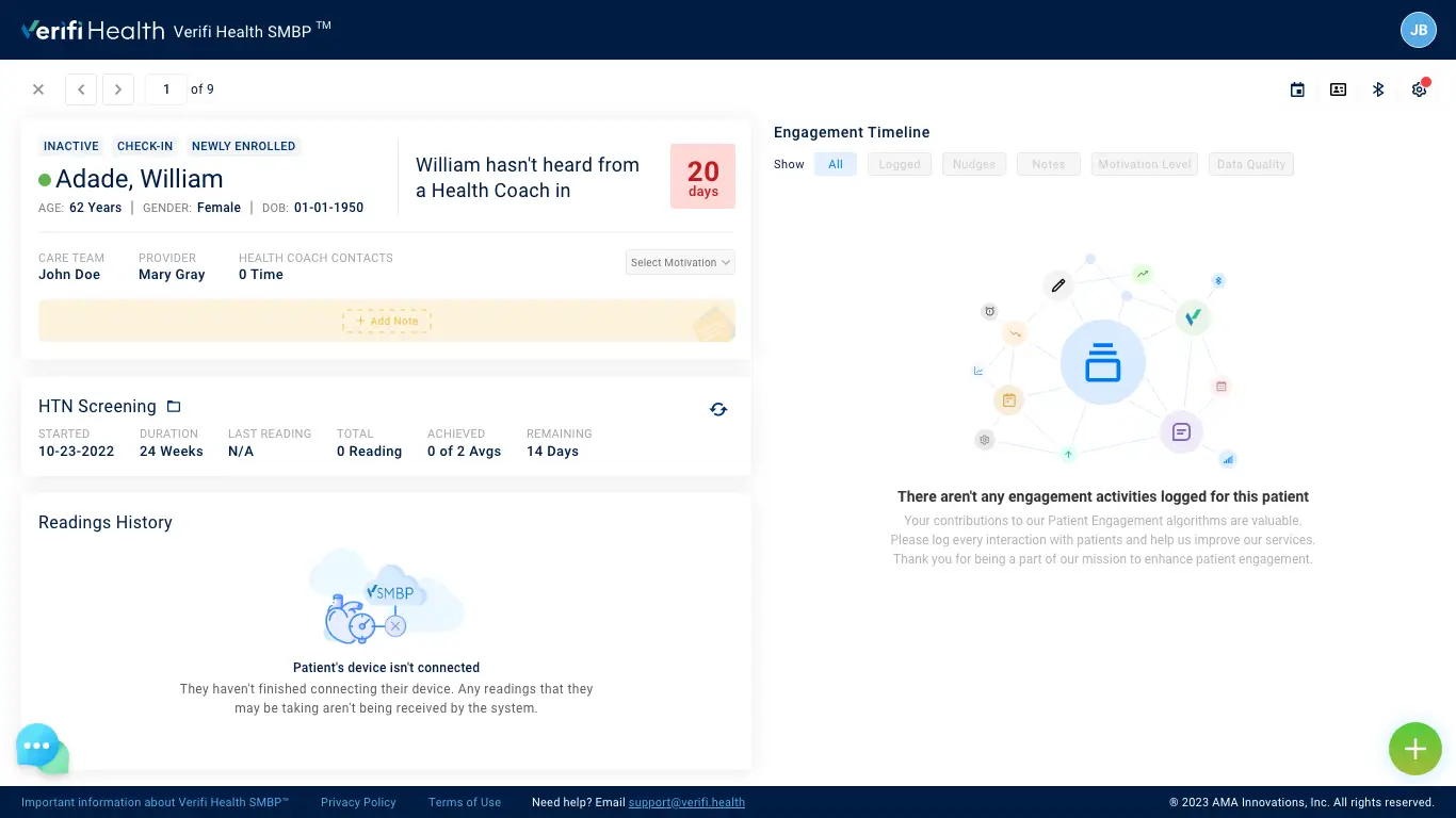
Self-measured blood pressure (SMBP) is a method of monitoring your blood pressure outside of a medical facility. It is typically done in the comfort of your own home or workplace, using a blood pressure cuff that you own. The main goal of SMBP is to give patients more control over their blood pressure, while also promoting the sustainability of medical practices and improving the safety and portability of healthcare data.
To help address this chronic health issue, the SMBP app has been created with a three-fold focus. This includes clinical features such as Clinical and Health Coach, as well as administrative and technical elements. The aim is to make it easier for patients to monitor their blood pressure and manage their health, while also making it simpler for healthcare professionals to access and use patient data.
My Role
- Day-to-day designer and mentor to a design team of 3.
- Developed and maintained a design language across desktop and mobile devices.
- User research, prototyping, UI design.
- Developer collaboration.
Date
- Dec.2021 - Present
The Goal
Turning a new leaf
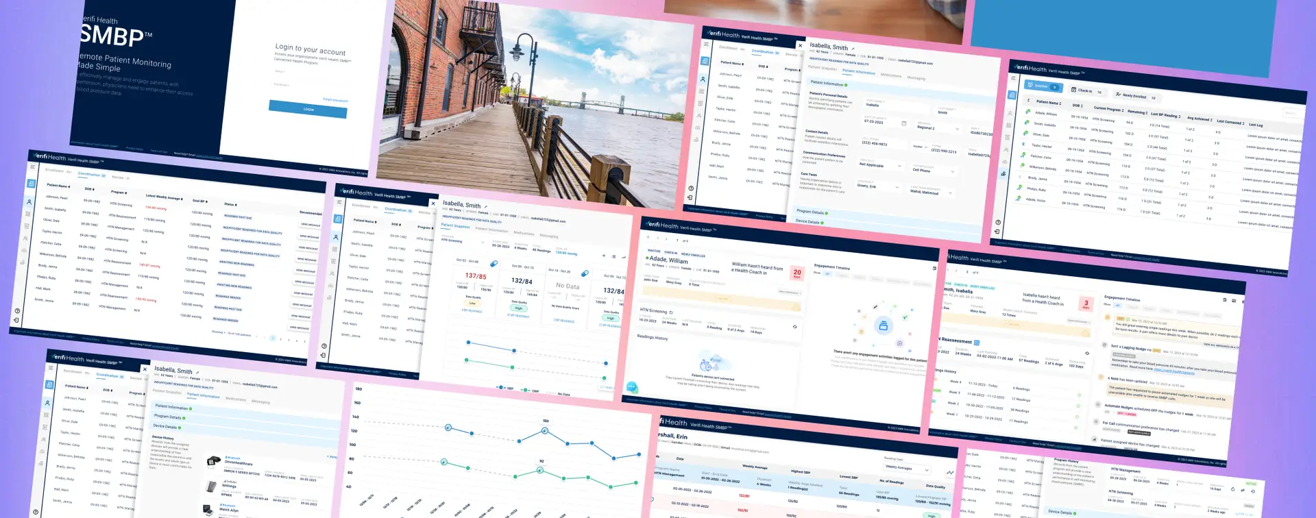
VH SMBP wants to change the way it presents itself to the world. With a fresh take on their audience and the design of their new features, we approached this redesign with the goal of upholding the new brand identity throughout the entire experience. We aimed to present VH SMBP in a modern yet human way to feel more connected and accessible to target audiences of different lifestyles while implementing the design using modern frontend frameworks.
Not only did we want to reach VH SMBP's new audience more meaningfully through relatability, but we also structured the site to allow AMA (American Medical Association) to capture leads more effectively by utilizing data customized to the user.
The User Interview
Collecting User's Pain Points
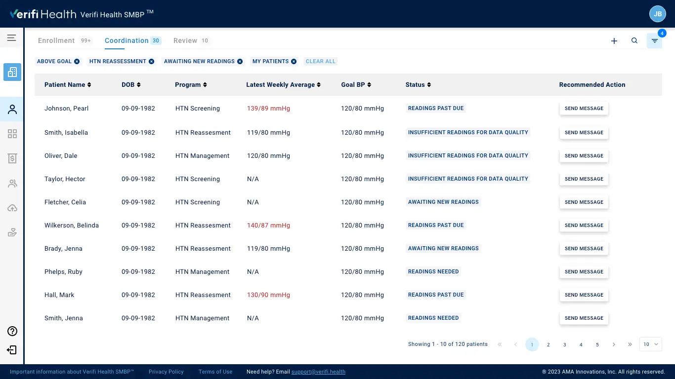
Currently, the application does not have an authenticated experience. This makes it difficult for providers or care team members to filter and categorize patients from the patient list.
Enrolling a patient into the application requires multiple steps, which is time-consuming and lengthy for providers or CTM.
As a provider or CTM who has a hectic schedule, They need accurate information about the patient’s health to make informed decisions. However, the screen often displays unnecessary information along with essential details, which can be confusing.
The current application does not track patient engagement or participation in the assigned program.
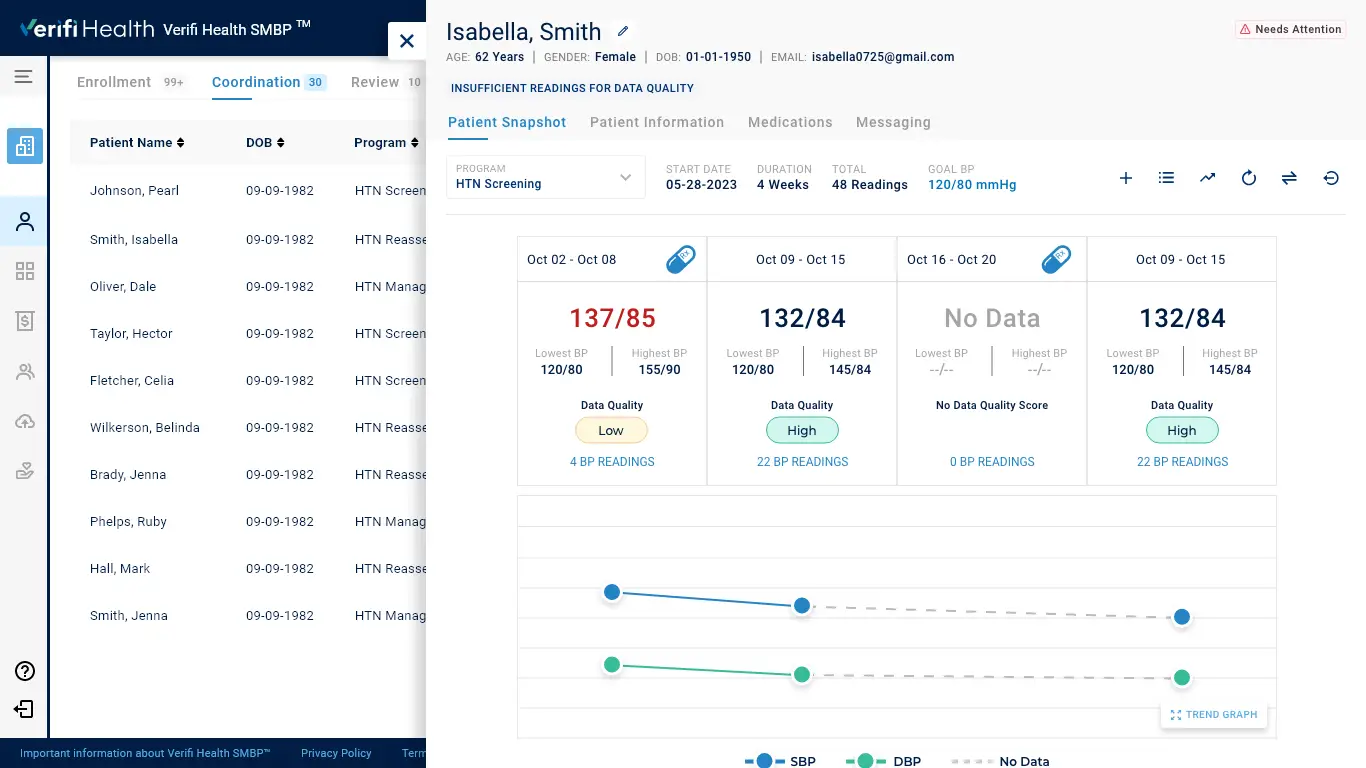
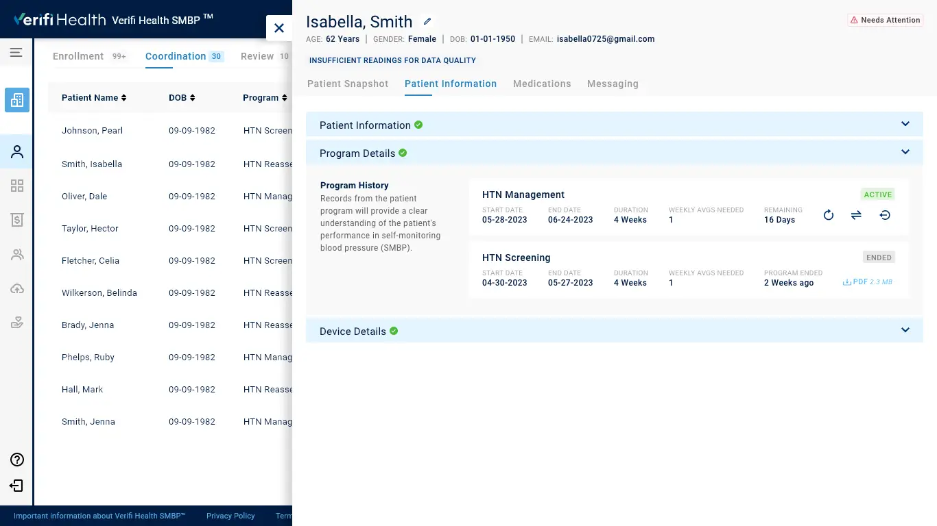
It’s challenging to determine which program a patient is enrolled in and how many days are left in the program based on the current snapshot of their health profile. Additionally, at first glance, there needs to be a way to identify how many readings have been submitted by the patient.
A weekly average trend graph, which is the initial key to identifying patients’ progress in their current program, is complicated to understand.
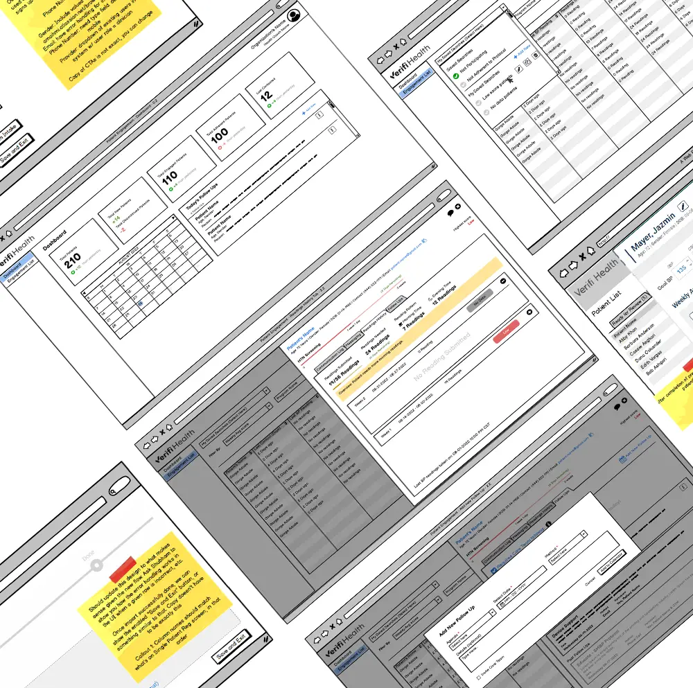
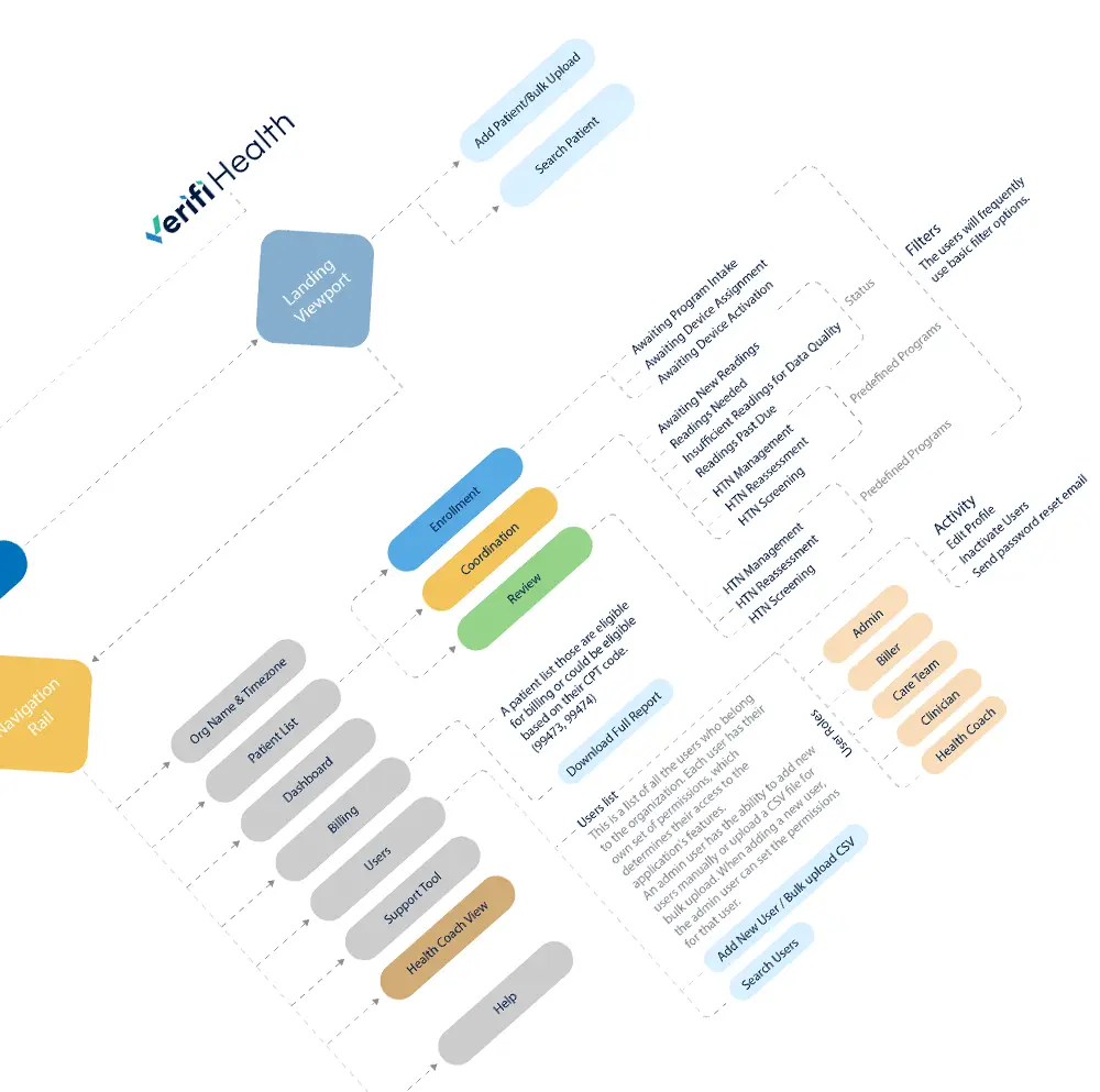
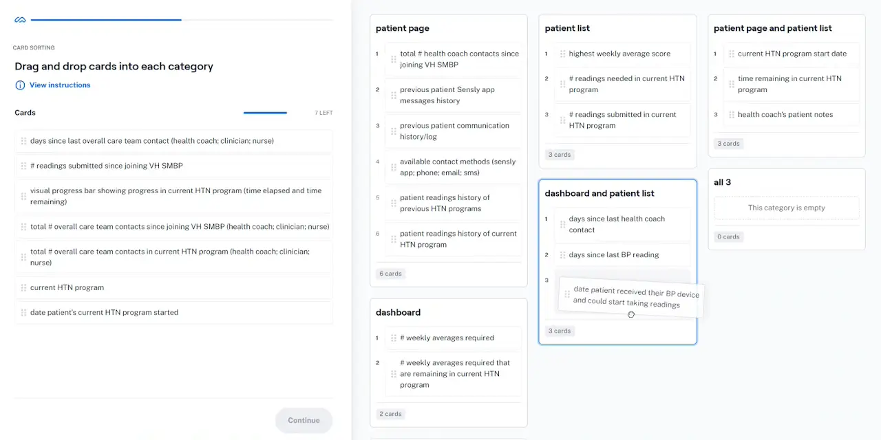
Card Sorting Activity
Card sorting activity is a significant and intuitive way to understand user's needs.
The Challenges
Bridging the Gap Between Application and User
The current version of the application has been developed on an older version of the PrimeNG library (v8.1). We need to verify whether the proposed changes are compatible with the current version.
If the application relies on a specific version, ensure the new changes do not conflict with it.
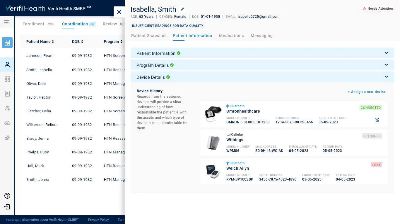
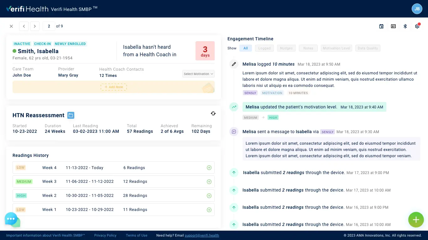
The following products will be affected during the upgrade of UI and Angular versions in order to ensure a unified user experience across all applications and their components: Clinical View (Provider/CTM), Health Coaching View, and Super Admin Panel.
It is necessary to develop applications that adhere to an updated style guide and component library, both for current and future features.
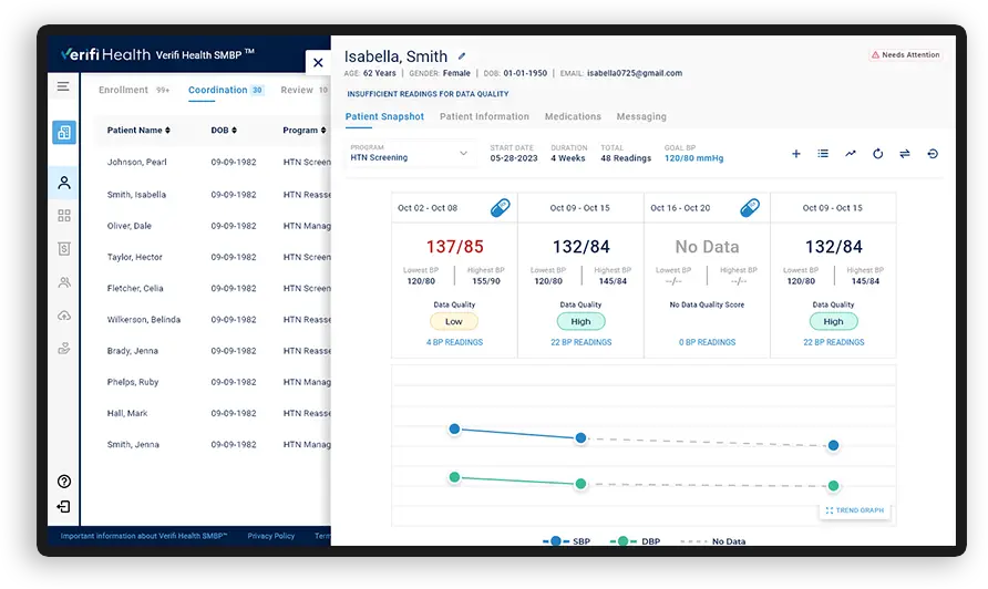
Clinical View (Provider/CTM)
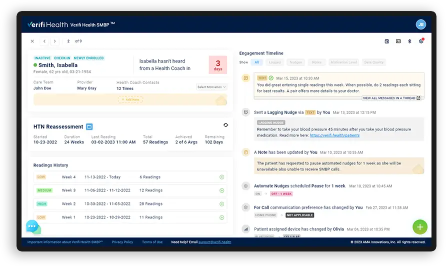
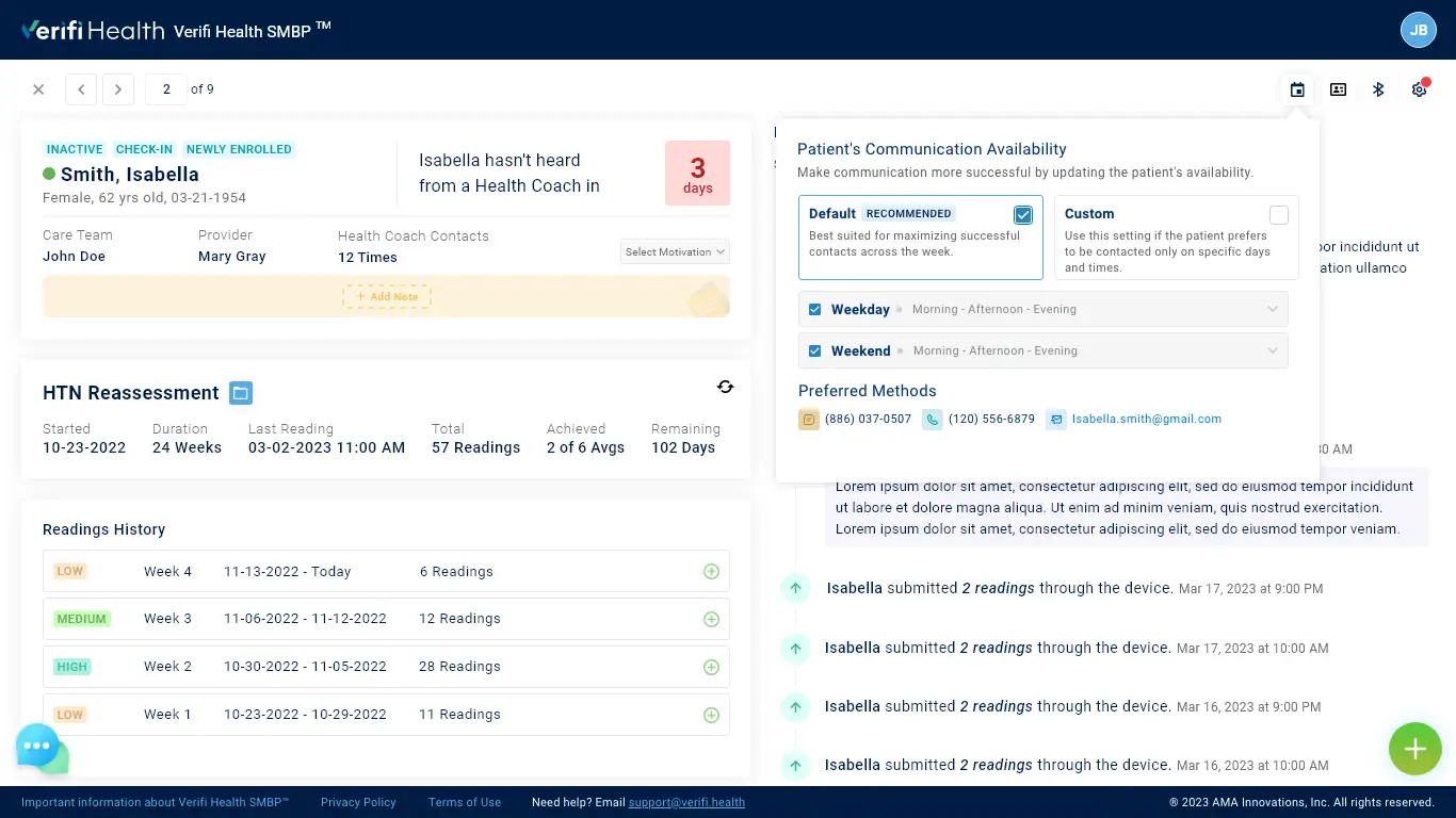
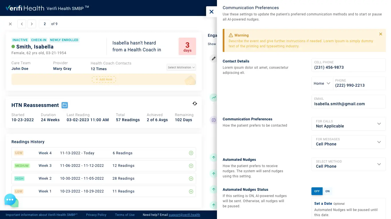
Health Coach View
The Solution
Consolidation the User's Data
Consistency in design plays a crucial role in enhancing the user experience by reducing cognitive load and increasing usability. Users can easily navigate and interact with the product or website without getting confused When encountering familiar design patterns, navigation elements, and interactions across different screens or pages.
The primary objective of this project is to explore ways to understand overall customer satisfaction and identify the key driving forces responsible for improving the user experience and customer satisfaction.
To ensure a high standard of quality and meet all necessary product requirements, we did a heuristic evaluation and identified several crucial categories that we can focus on to enhance the user experience. Through these efforts, we can improve the product without compromising any essential features of the application.
- Improve Web Accessibility
- Color Accessibility
- Font Accessibility
- Component Design & Best Practices
- Application UI Design Systems
- Pinpoint & Compare the Old vs New Improved UI
Color Accessibility
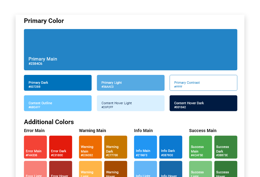
Color themes are designed to be harmonious, ensure accessible text and distinguish UI elements and surfaces from one another.
The primary color is subtle and futuristic. It shows the positivity of our brand. We have spread it based on distance in a tone that creates contrast.
Font Accessibility
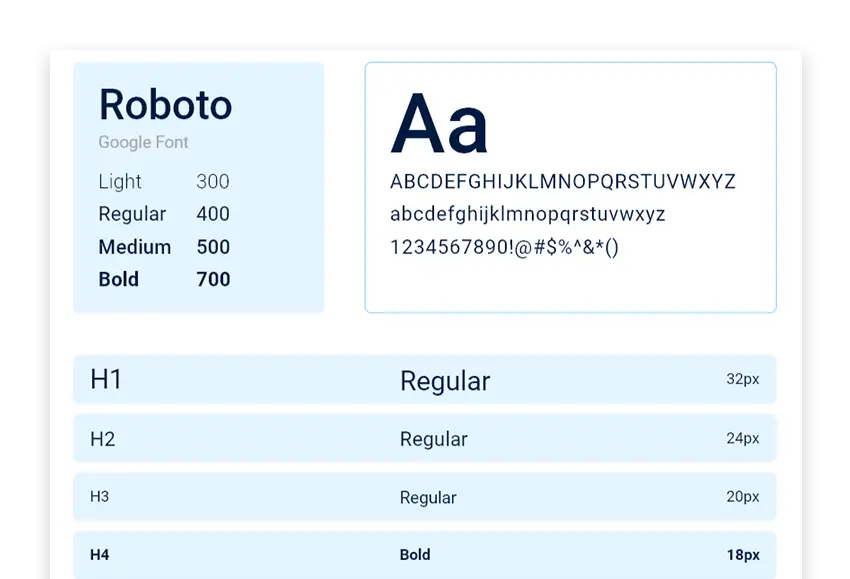
While conducting my analysis, I discovered that the current product utilizes the Roboto typeface. However, I noticed that it lacks proper text hierarchy. To ensure consistency in the context, I have created a text hierarchy chart. By following this chart, the product will have a consistent look and provide a better user experience across all screen sizes.
Component Design & Best Practices
As a vital member of the product team, I was responsible for the spacing and padding. So, I went through some design systems and checked how they maintain their design consistency. Design systems sort it out by multiplying even numbers of 4 and 8 pixels.

The Design System
Building a System that Scales
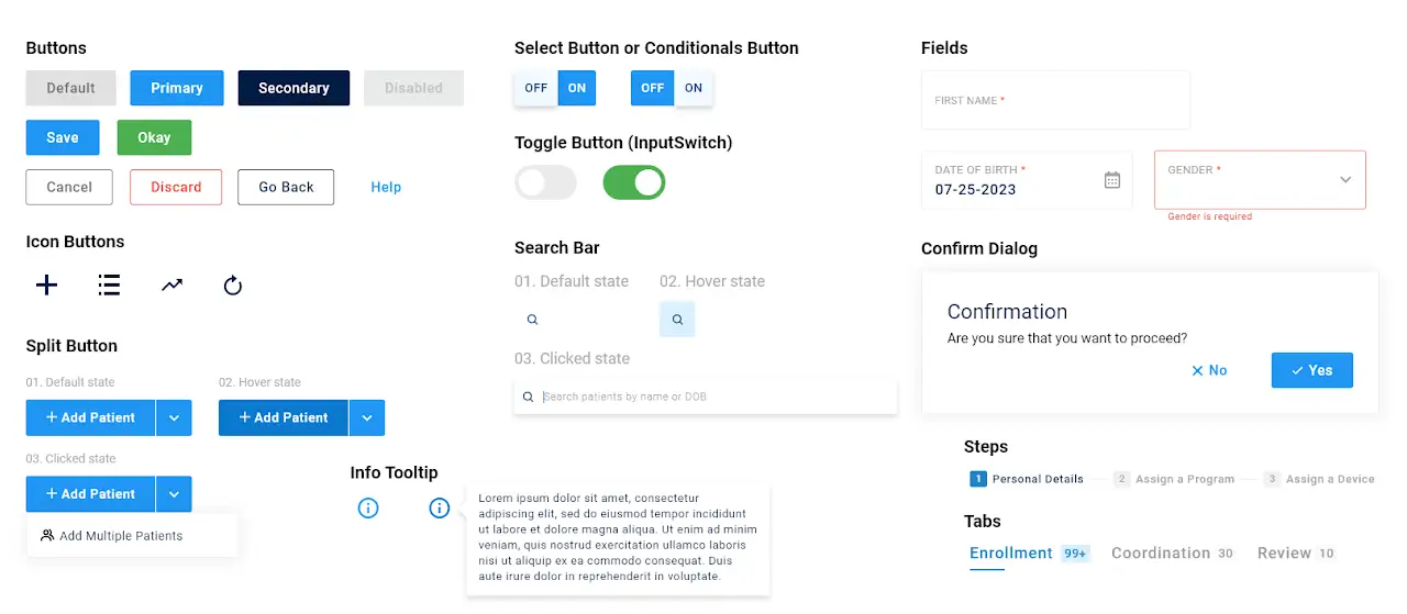
During our analysis, we uncovered that the current product uses the outdated Prime NG version 8 native angular framework as compared to version 16. We also noticed inconsistencies in the design and behavior of existing components. Additionally, since AMA has plans to release other products under the same umbrella, we took great care in documenting the design system thoroughly and creating multilevel components that can be easily adapted for various scenarios. This approach allowed us to develop a flexible and scalable design system that can evolve and grow with AMA’s needs.
User Testing
Starting with the User
During the initial design stage, we realized the importance of aligning our designs with the needs of the user. To accomplish this, we created a prototype to test and collect feedback from AMA’s target audience. This helped us fill in any gaps from our research and gain insight into the user’s behavior.
Our research showed that users, providers, or care team members rely more on the trend graph rather than just looking at the numbers on the screen. We recognized the need to incorporate more current program-related data upfront on the screen along with all other actionable options, which should be on top of that. This allowed us to create a more user-friendly experience that resonated better with AMA’s audience.
Findings
Actionable Insights
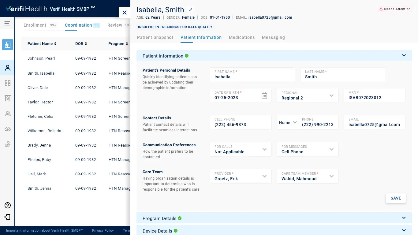
Providing more relevant information about the patient and program while selecting a patient from the list.
Showing weekly average BP readings along with the trend graph on a single screen.
More prominent placement for searching or filtering the patients.
Medication events are up-front on the snapshot.
Consolidated all the engagements or communication histories in one place for easily tracking patient’s progress.
